Kinnon Hostel
Freedom inspired by Thai Folklore
Branding
Creative Direction
Graphic Design
Placemaking
When envisioning the Kinnon hostel concept, inspired hotel entrepreneur Natviroj drew heavily from the enchanting Thai folklore of the Kinnara. This beloved half-human, half-bird entity was renowned for her poetic talents, dance, and song. The hostel's name emerged from an amalgamation of "Kinnara" and the Thai word for sleep, "non," forming "Kinnon." The Kinnari symbolizes traditional ideals of feminine beauty, grace, and achievement, which Natviroj sought to infuse into her new hostel venture. Tasked with creative leadership, I embarked on the challenge of developing an identity system that encapsulated the essence of timeless freedom and elegance, catering to a refined and discerning upper-market guesthouse clientele.
Inspired by the Kinnara
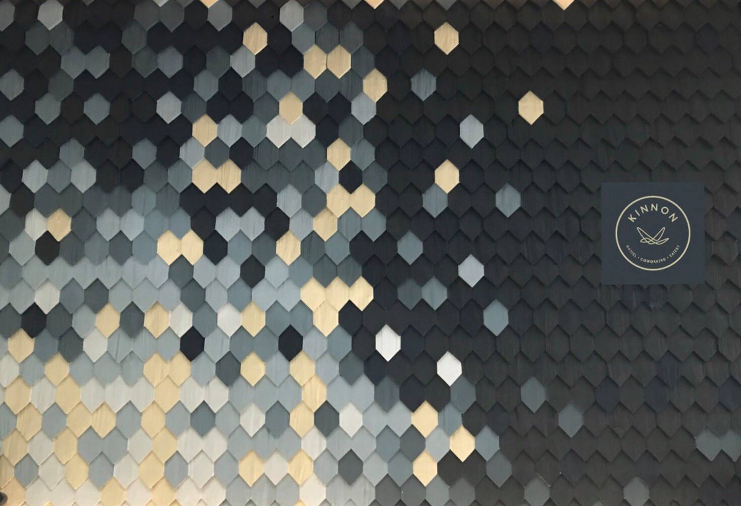
Intricately weaving the spirit of freedom and elegance, the Kinnon hostel identity came to life. Its name, a union of culture and slumber, echoes the enchanting allure of the Kinnari's legacy. The branding embodies a fusion of contemporary sophistication with the Kinnara's timeless grace, captivating a niche clientele with an appreciation for refinement. The visual identity celebrates the essence of eternal freedom through fluid, organic forms, while a palette of soothing hues resonates with tranquility. Each design element, from the logo to the typography, reflects the duality of the Kinnari - embodying both the ethereal and the grounded. This identity beckons to a select travel savvy audience seeking a sanctuary that harmoniously blends elegance, heritage, and modernity.
The Kinnon logo system
The Kinnon logo is an integral component of the brand's identity, and its application should be deliberate and uniform across all contexts.
There are six meticulously designed formats for the Kinnon logo. These logotypes are intended to be used exactly as presented, and their individual elements must never be disassembled or modified.
The wordmarks have been crafted for instances where the full logotype may not fit due to spatial constraints or busy backgrounds.
The stack logos have been tailored for official corporate use, ideally suited for conventional business applications.
The horizontal format finds its purpose in website titles and other scenarios where the square format isn't conducive.
The circular format stands as the primary logo for marking and consumer engagement. This specific logo lockup should be embraced for signage, stationery, and marketing materials. Its embodiment aligns most harmoniously with the mood and essence of the Kinnon brand
The Kinnon typography
The Kinnon brand strategically employs a trio of English typefaces to create a harmonious typographic identity.
The first, Open Sans Extra Bold, emerges as a bold and impactful typeface, reserved for headings and accentuating words in print materials, posters, billboards, and web applications. It offers flexibility, adaptable to both lowercase and all-caps usage.
The second, Open Sans Regular, presents a sleeker variation suitable for larger text bodies, such as this very paragraph. This typeface accommodates diverse scales, ranging from larger all-caps applications to smaller upper and lower case usage.
The third, Cooper Hewitt, adds another layer of nuance. Serving as a thinner option for headers, subheads, highlight statements, captions, and smaller text blocks, it caters to varying levels of typographic hierarchy.
Furthermore, the Kinnon brand incorporates two contemproary Thai typefaces, which should be employed selectively when the situation demands. For all Thai text, PLSxKittithada Bold and Regular are the designated choices, ensuring a consistent and refined Thai typographic presence.


