Piercing, perfected
NooYoo
Project locations:
25+ Locations around Asia
Brand Identity
Art Direction
Graphic Design
Environmental Graphics
Packaging Design
Agency: Whitespace
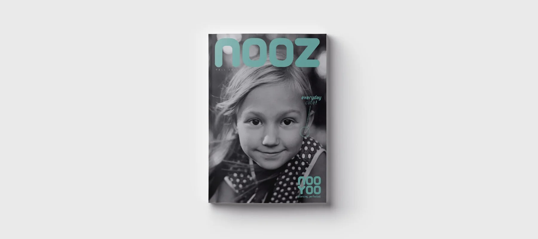
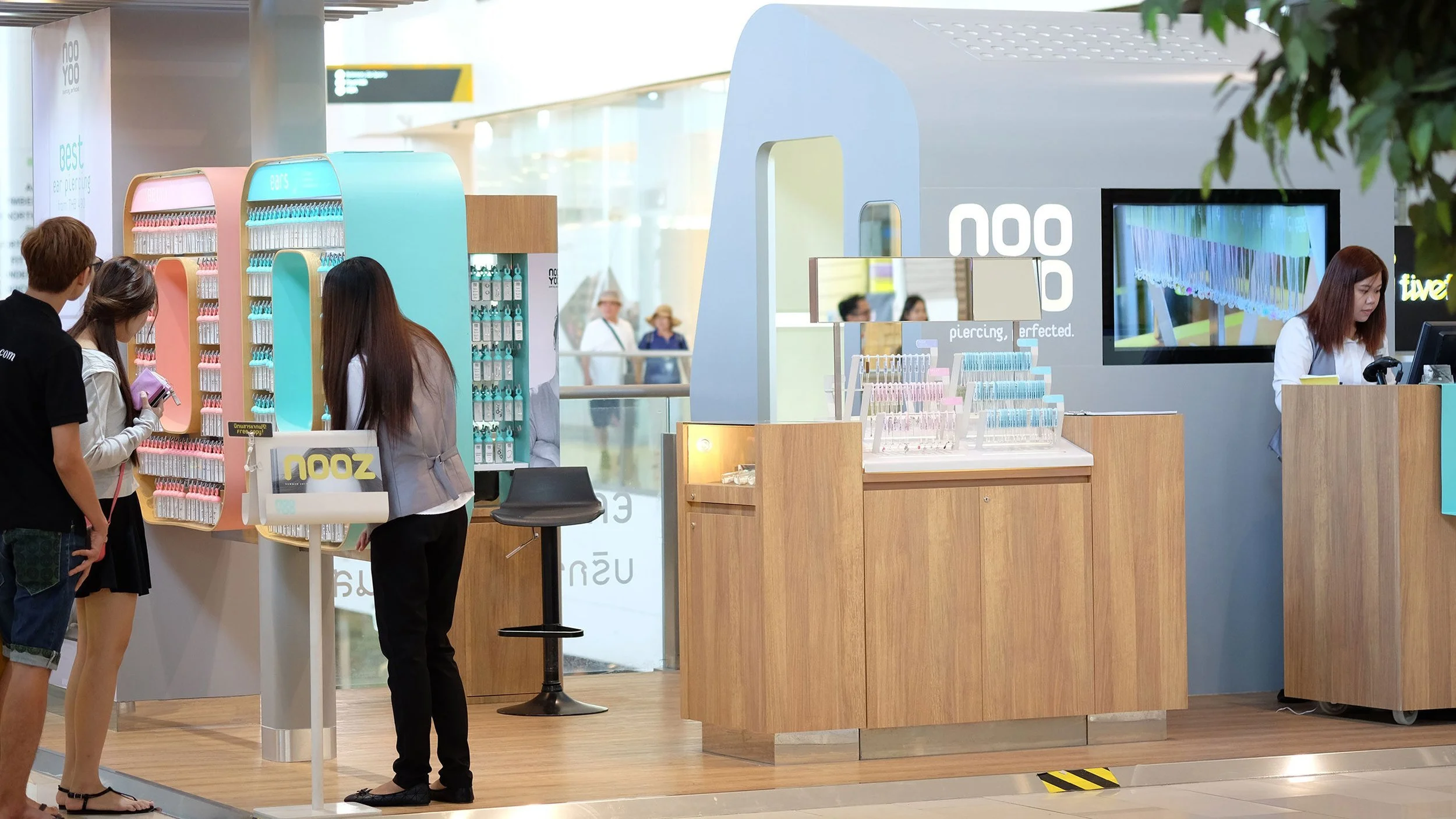
While working at Whitespace Ltd., one of my first projects was to lead the design team to design a new jewelry retail concept. The idea was to create a new face for body piercing and provide a hip alternative to the traditional jewelry stores. Starting with the name, which highlights the personal significance of body piercing - the identity itself is presented confidently, but with a soft edge. The key color nods to clinical sterility and cleanliness. Its tagline further projects confidence and expertise.
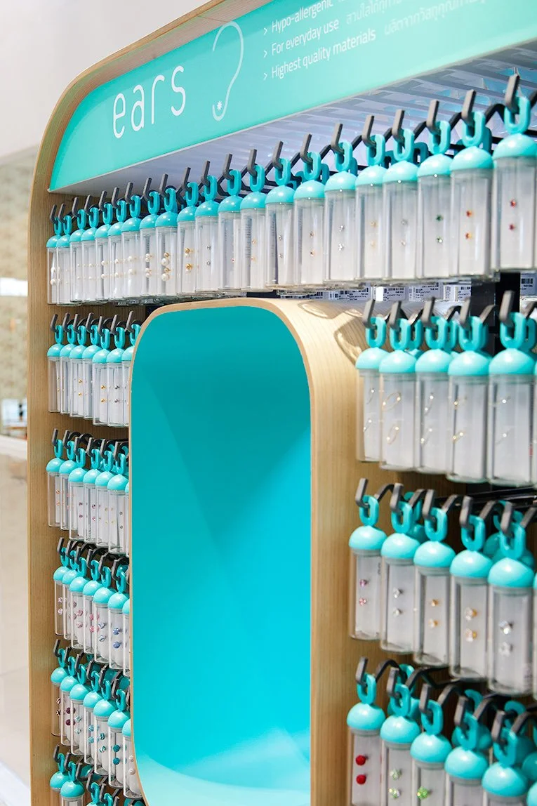
Packaging was a part of an integrated brand design solution for NooYoo, so Whitespace set out to reinvent low-cost jewelry packaging by creating a collectible, branded glass container, with color-coded caps to help customers distinguish between ear, nose and belly button jewelry. I collaborated with the industrial design team to develop all aspects of procurement of the glass and engineering of the plastic and silicone components.

